Data Humanism: Visualizing data to connect people with numbers
DATA VISUALIZATION | VISUAL DESIGN | CIVIC FACILITIES | COMMUNITY
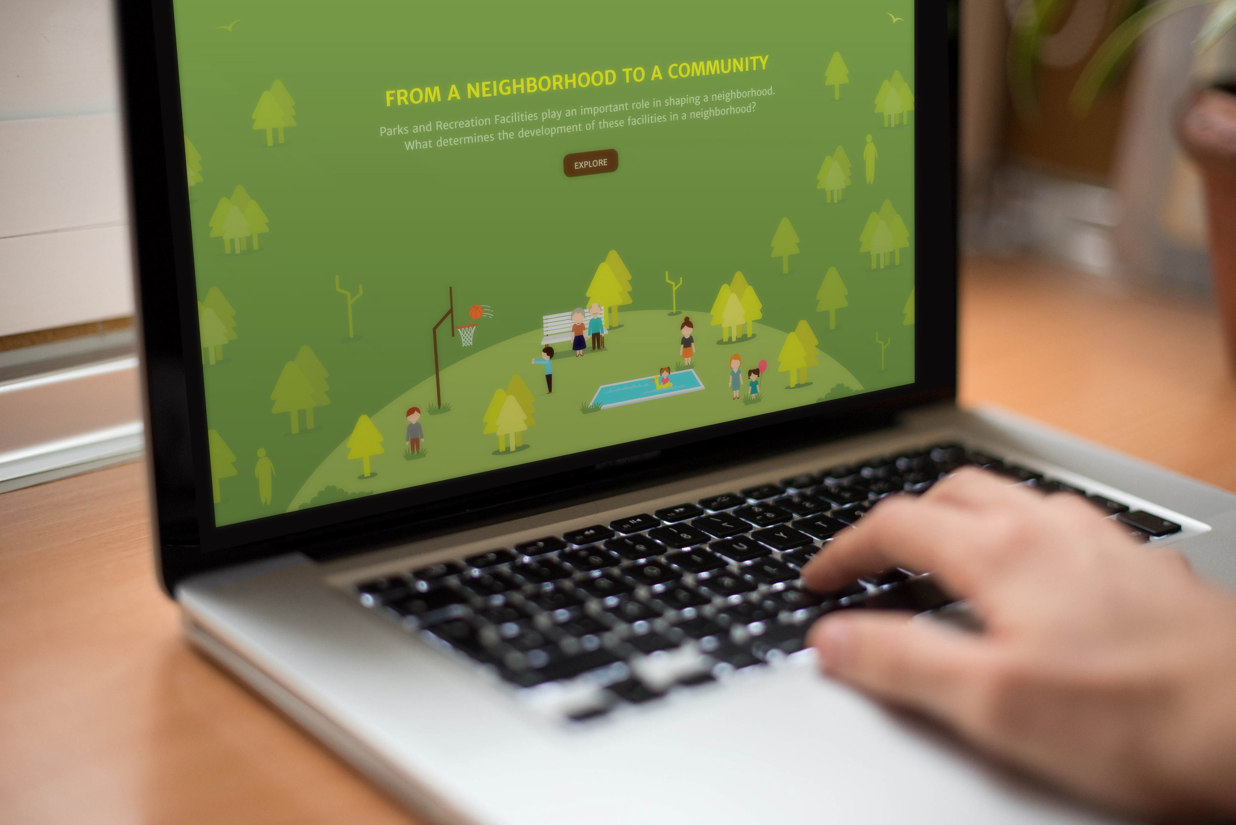
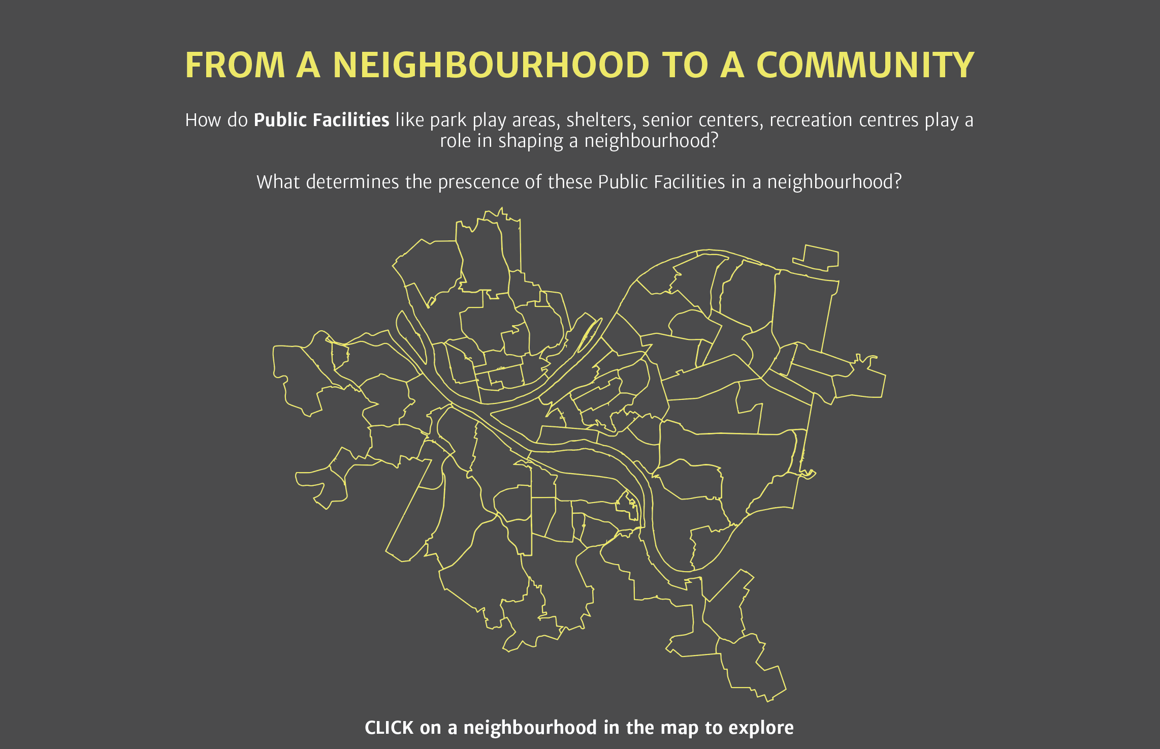
A web-based data visualization platform that unpacks and translates the quantitative data on Parks and Recreation facilities into informative and engaging visuals to aid both citizens and city officials in making more informed choices.
DURATION: 4 Weeks
MY ROLE: Data Visualization, Visual Design, UI Design, Storytelling
TOOLS: Google Sheets, Illustrator, Keynote
“Human nature is in the center of data universe.
Meaningful connections with data are important for understanding them.”
DESIGN PROCESS
01 UNDERSTANDING THE CONTEXT
Why do it?
There is a huge amount of data in the digital world that we live in but it is the same abundance of data that makes it difficult to process it into a relatable and usable form. To make meaningful connections, it is important to tell a story that piques curiosity and generates interest, something people would want to see and know about, understand its purpose and sense a connection to their lives.

How might I visualize the available datasets to explore patterns and relationships between them in a way that is both relatable to and usable by people?
02 DATA ANALYSIS
Collecting & Cleaning the Data
Looking through the available data, I decided to map the demographic data along with the data on parks and recreation facilities in Allegheny county to explore patterns and relationships between the two.
To make sense of the data I had gathered, I cleaned it up and categorized it using data organization tools like Coordinate systems and LATCH principles. These data sorting methods enabled easy analysis, comparing, and contrasting of the information packaged in the data.
The aim for the visualization was to investigate the relationship, if any, between civic infrastructure and the demographic make up of a neighborhood and present it in a way that people could engage with.

Exploring the datasets
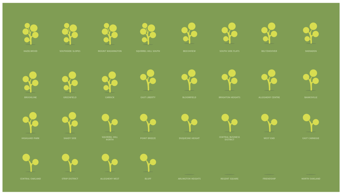
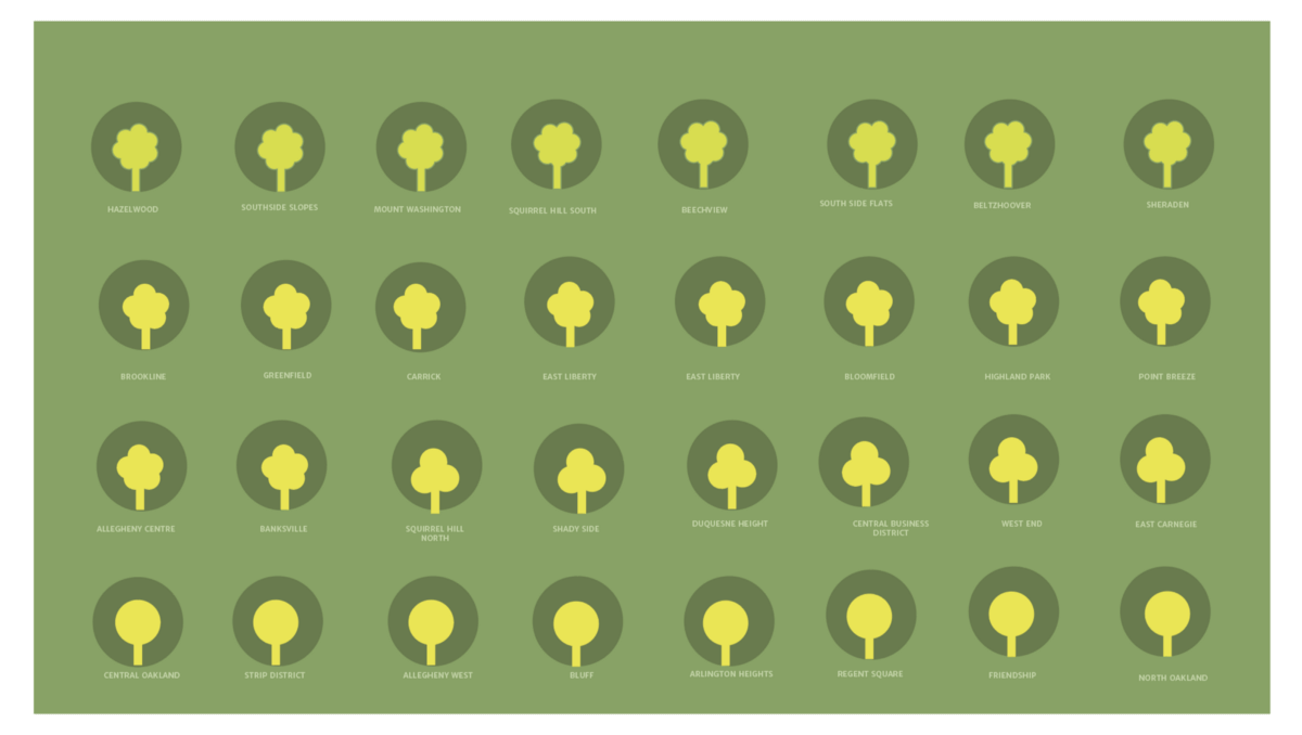
I mapped datasets like population density, Land area, Average age, Median Income in each neighborhood against the number of parks and recreational facilities in that neighborhood.
On exploring the data, I found no definite patterns or relations between the various datasets. If there were any, my untrained eye definitely missed so. And, although I didn’t get straightforward results I continued to visualize the data sets to explore in the hope to learn something new in the process and with the intent to find a way to make these datasets useful for people.
Due to project timeline constraints, I explored only about half of the 91 neighborhoods in Pittsburgh.

03 VISUAL DESIGN
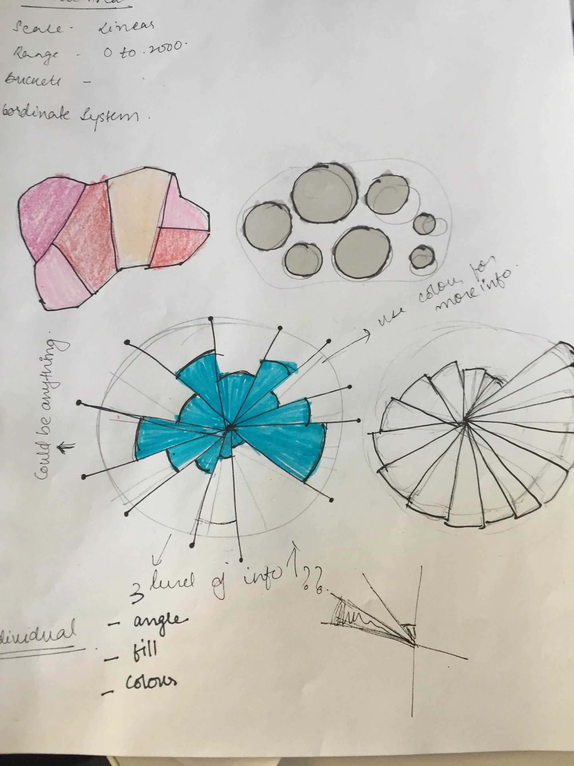
Exploring the form
Nathan Yau, author of ‘Visualize This’ and ‘Data points’, provides valuable insight into data strategies and visual systems. He suggests that visualization plays a major role in making data available and useful to those who are and aren’t necessarily data experts.
To build a more cohesive visual design language, I played with the use of visual variables to develop ways that linked form and function; ways in which data could be represented based on its meaning.
Initial concept : User testing, Feedback & Redesign
Using speed dating as a research method, I interviewed 10 classmates, asking for feedbacks on my initial concepts. Insights from the user testing:
The narrative works well and generates curiosity that leads to engagement
The nuances of interactions were overshadowing the representations of the content, focus on form explorations
Use visual variables more effectively to match the content
There is value in both the grid and map system and should consider keeping both
Form Exploration & Refining
Based on the feedback received during the speed dating, I revisited the visual forms with a clear objective of building a strong connection between form and content so that understanding wasn’t dependent on the use of a key.
I focused on investigating the use of more literal forms that could enable viewers to easily derive clear meaning while also highlighting inherent patterns. The idea was to build an overarching form so that if someone looked at the piece from afar, they could grasp the focus of the piece.
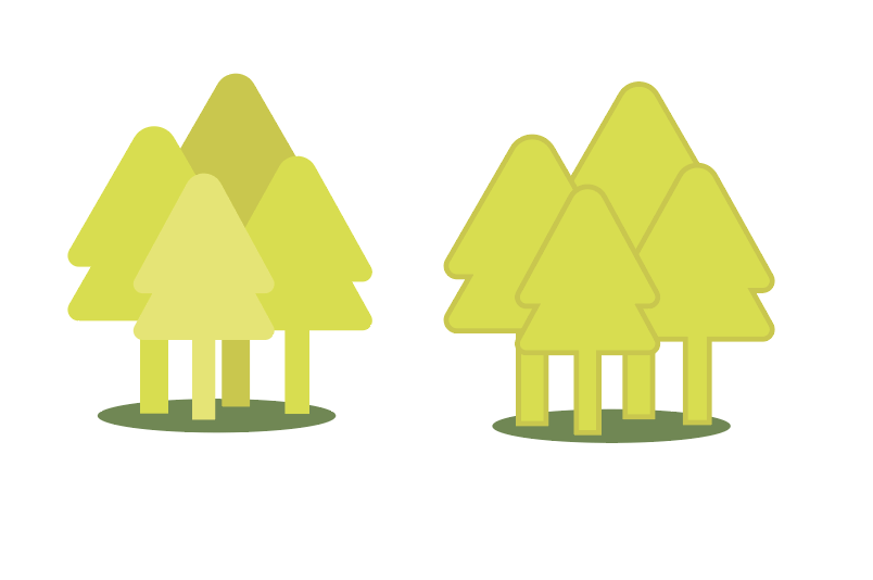
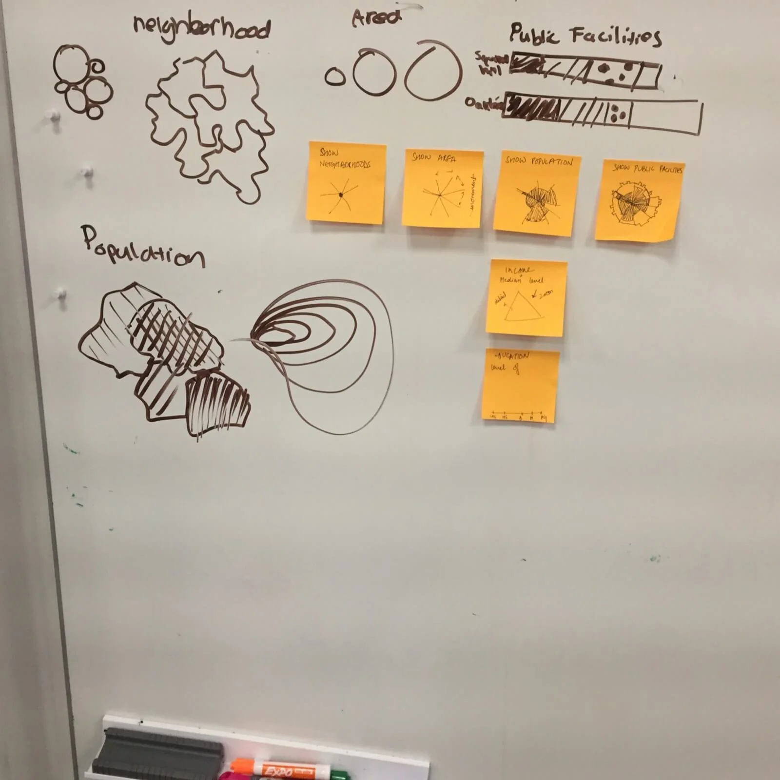
Visual Design System
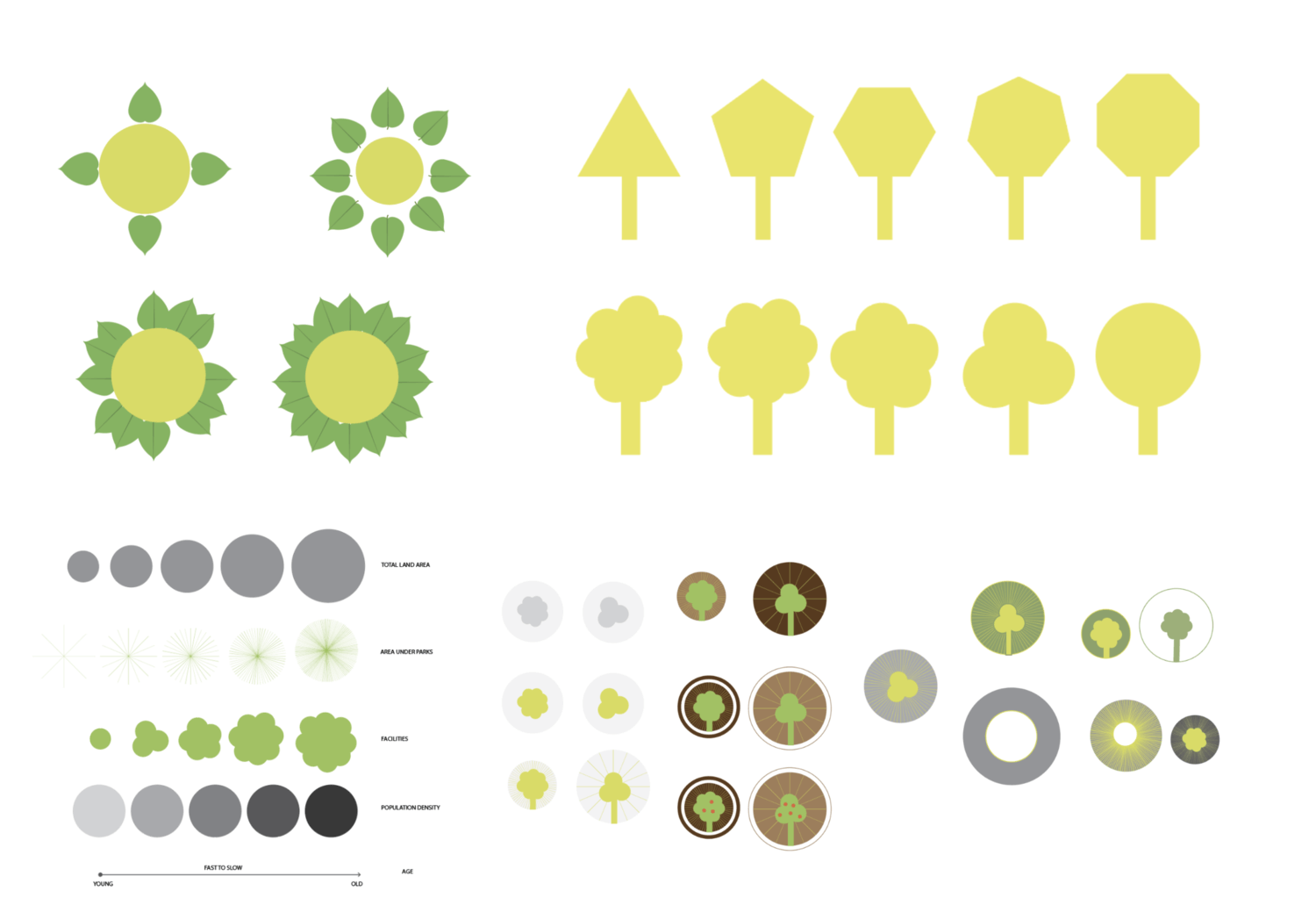
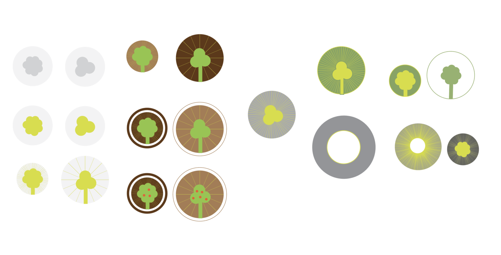
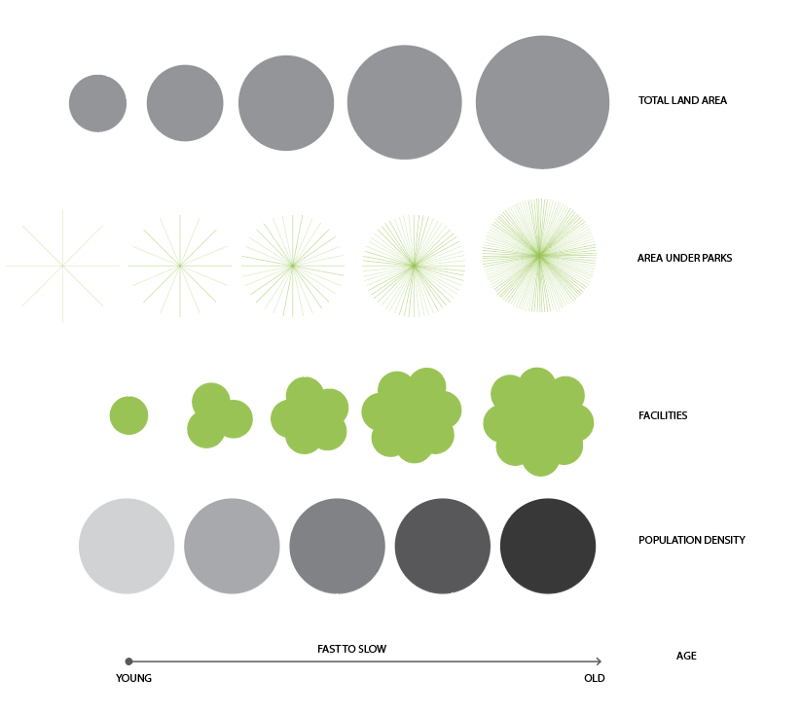
Using trees as a central character, I built my narrative around it. This enabled me to successfully connect elements that don't seem naturally related, like red berries for money. Weaving the elements together made it easy to for users to recall the various associations and visual representations.

Final data sets explored
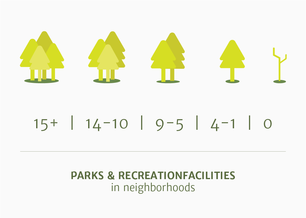
The use of trees as a representation of parks and recreation facilities immediately provides context to the viewer

Lines+Motion represent Age group.
Inspired by tree rings, it builds on the existing narrative by drawing parallels between age of trees and neighborhoods.

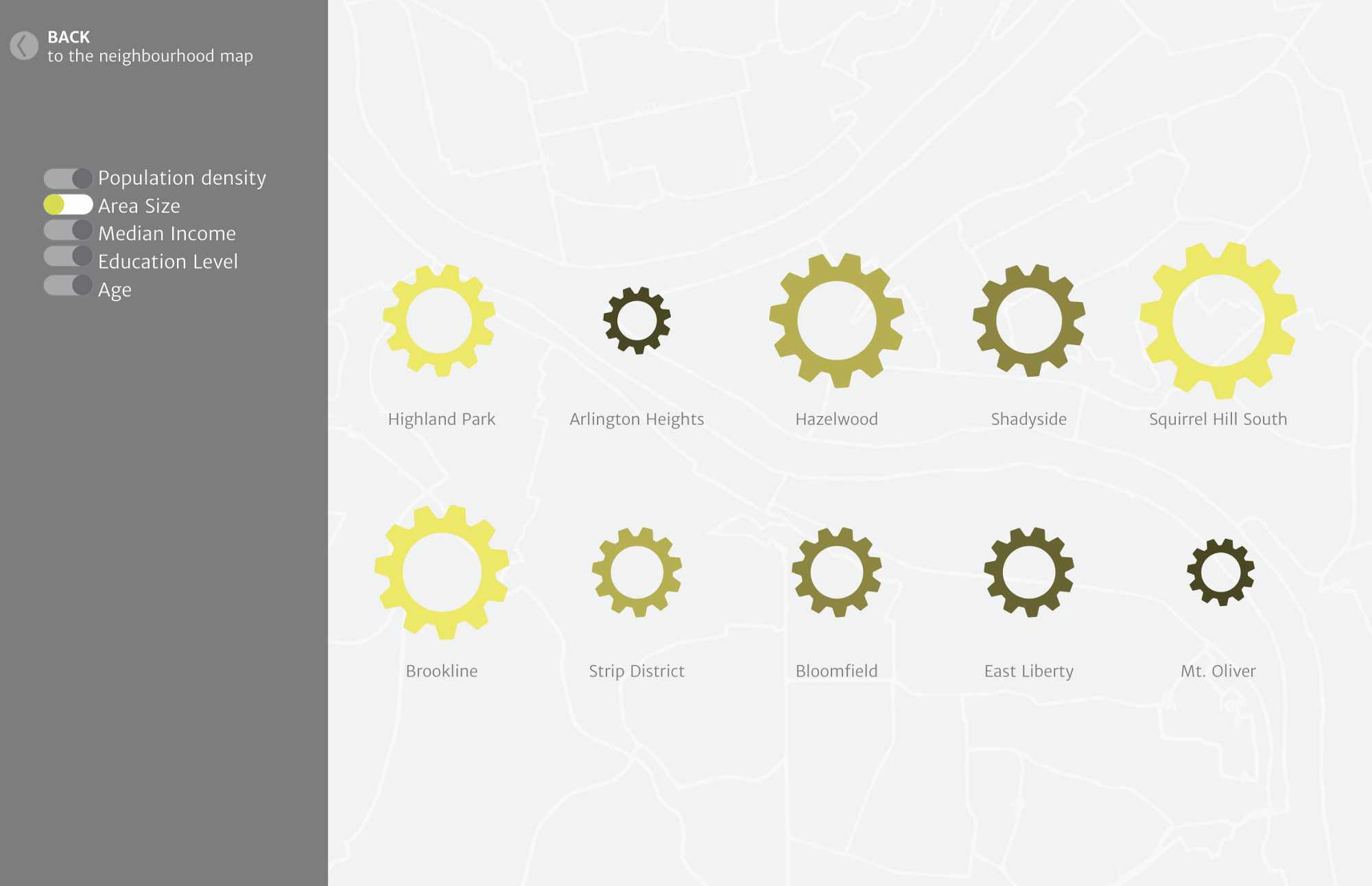
Use of Scale to denote Area. The simple visual relationship reduces the cognitive load on viewers

Use of Color to represent Population Density.
Building on pre-existing visual cues like intensity of the color to represent a linear hierarchy

Color +Quantity denote Median Income. Although not directly related, the fruit-like graphics are easy to remember in the over-all narrative
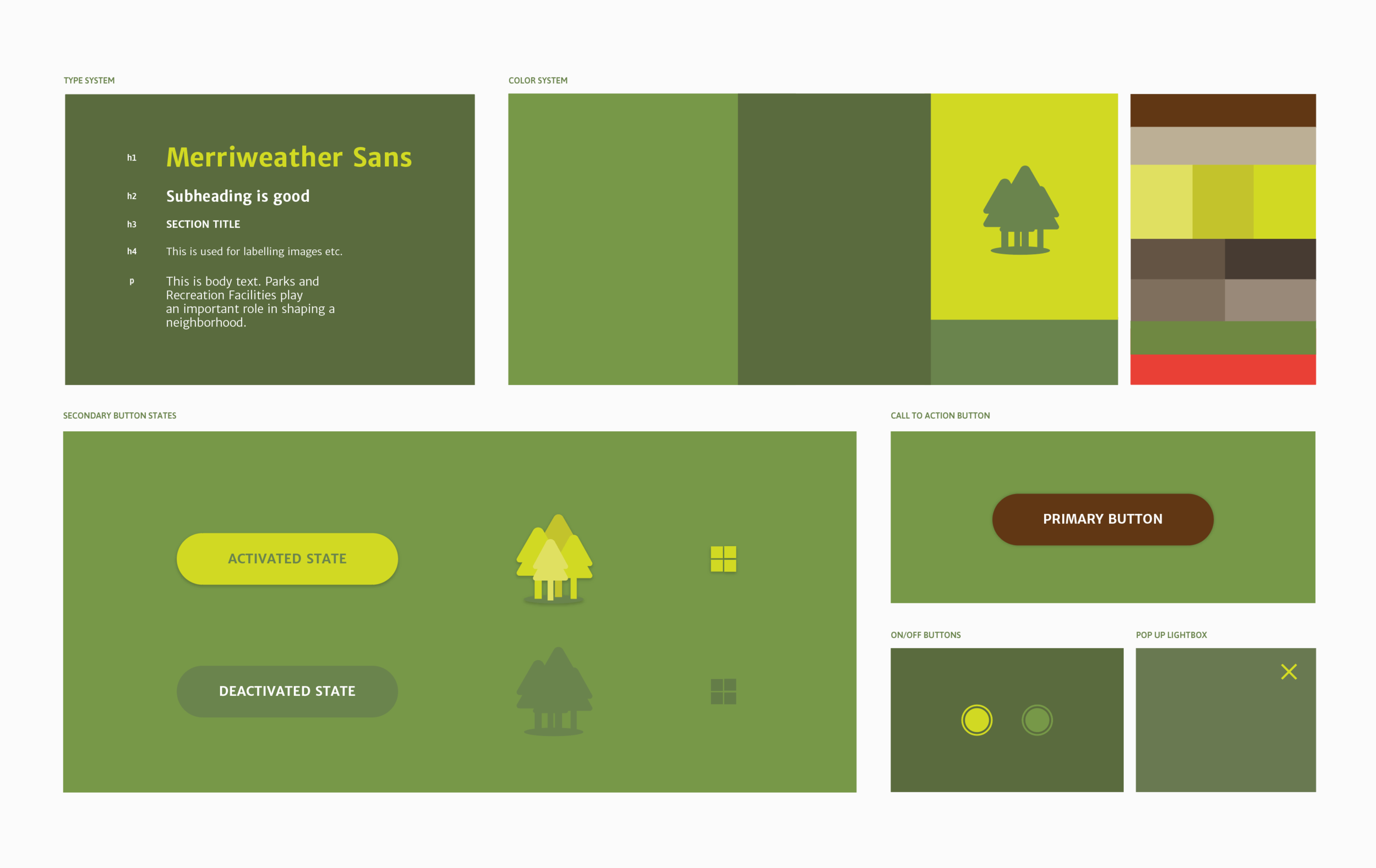
The interface has minimal use of text and is mostly used in small font size. Hence, for the typeface, I decided to use ‘Merriweather Sans’. It is a typeface specially developed for screens, has several weight options and its large x-height gives it excellent legibility.
Color Accessibility Check
Since the design uses a lot of shades and tints of green, I decided to test the colors for deuteranomaly which is a reduced sensitivity to green light and is the most common form of color blindness.
Normal View
Deuteranopia View
04 THE INTERACTIONS
How will the story unfold? What will be the key Interactions?
A user's ability to customize his/her interaction with this piece is key to the value he associates with it. What would interest users? How do these numbers connect to their daily lives? What does this data mean for them? What would they want to know?
Understanding the expectations and motivations of the people who would use this visualization is crucial for the interactions being built into the visualization platform.
Stakeholders
City officials involved in the planning and maintenance of these facilities
Residents of the neighborhoods
New people relocating to the city and deciding between neighborhoods
Initial explorations of the user interface
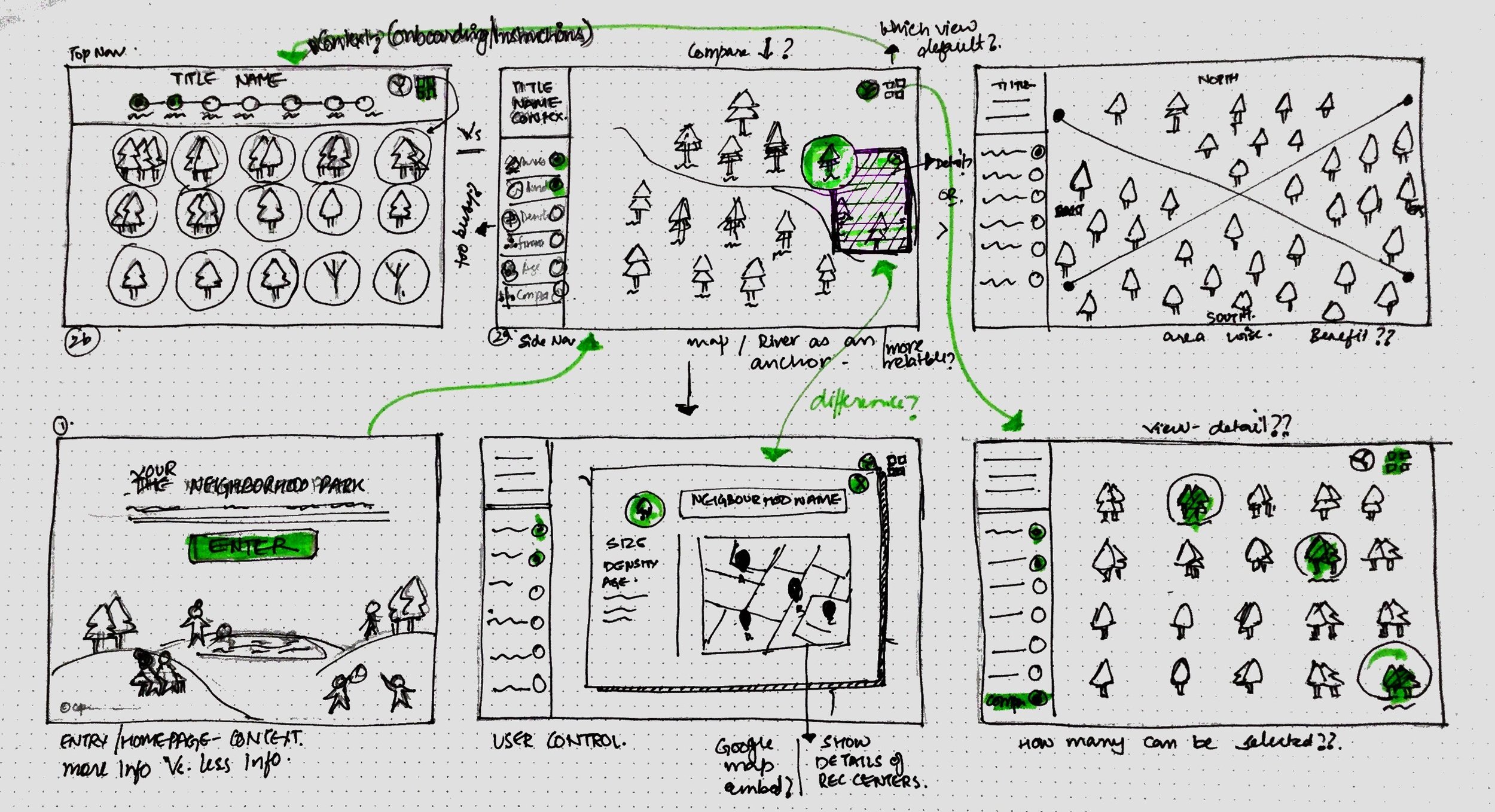

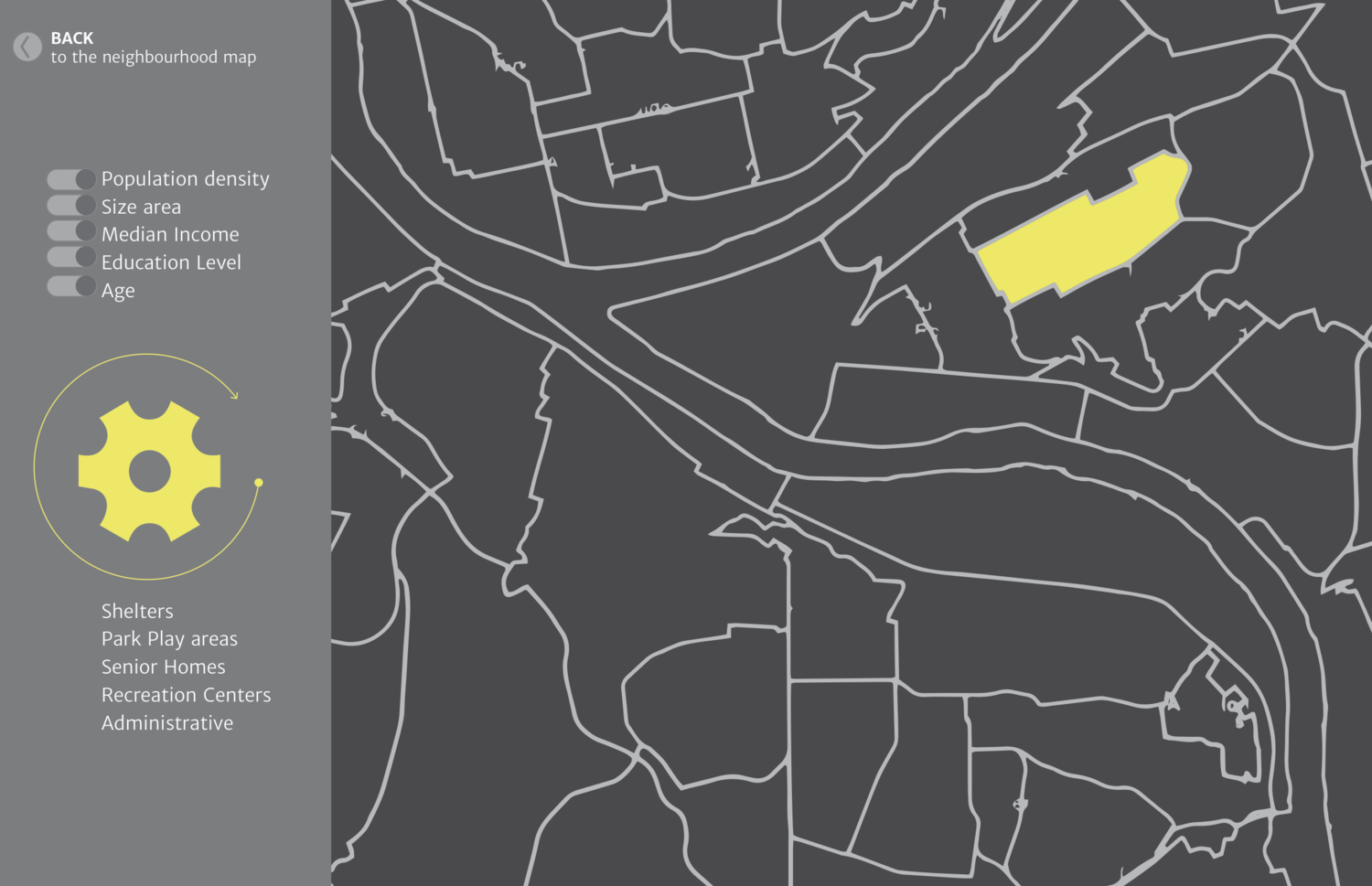
The primary Interface Elements
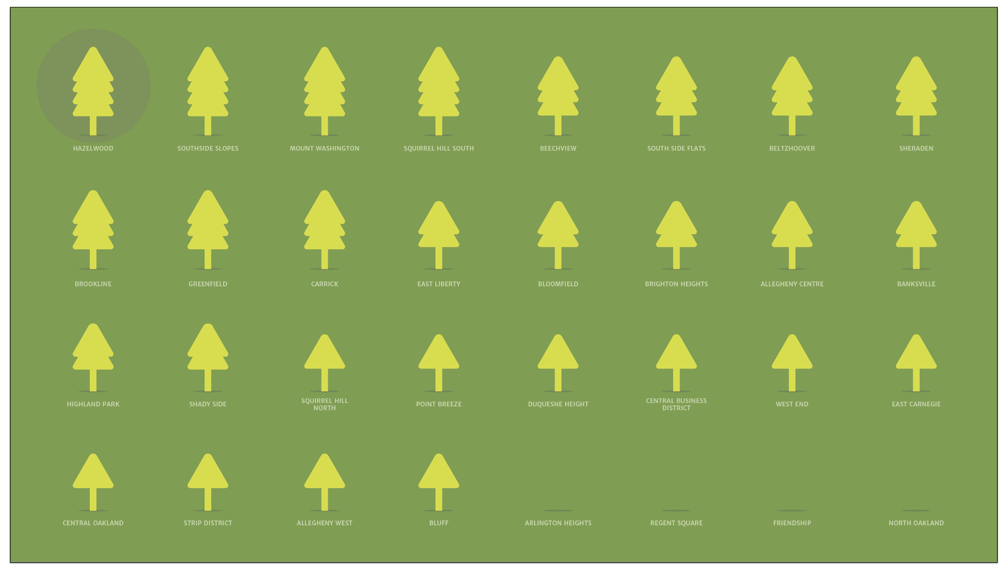
Hover State: Each neighborhood is represented by a symbol which represents the number of park and facilities in that neighborhood. Hovering hover a symbol reveals the neighborhood and the number of park and facilities in it.
Floating Key Panels: floating key panel for each data set is collapsed with in the side navigation bar. The visuals have been designed for easy association and recall, providing a key is still helpful during the initial interactions.
Collapsible Side Nav in Fullscreen Mode: The full view mode hides the navigation menu allowing more space for comparisons and analysis

Map View: Useful to explore in relation to a neighborhood

Grid View: Useful for a holistic overview, comparative analysis & revealing patterns
Key Interactions

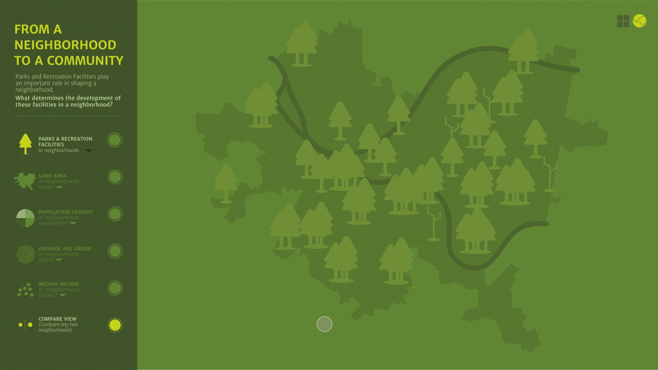
1. Map view: The map view is the default setting. People tend to start with what is familiar first. After selecting the neighborhood, users can toggle between other datasets to layer information and explore the visualization for new patterns and relationship.
2. Map View Compare: The compare feature is helpful for comparing data between two-three neighborhoods. It also provides a better perspective on an area over a single neighborhood. The spatial comparison could also be informational for new people relocating to the city.
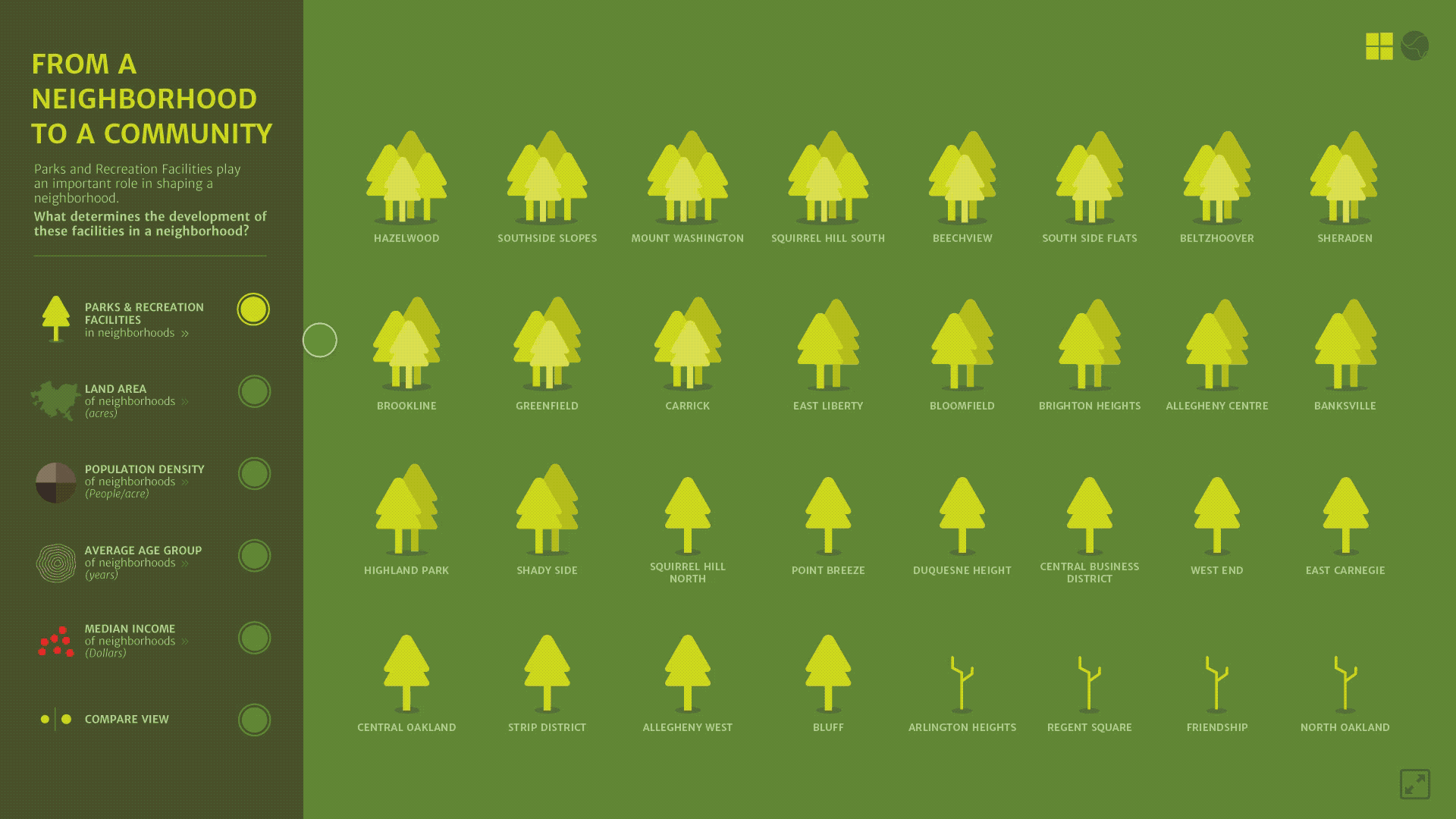
3. List View: The list view allows to get a holistic people and surface patterns and relationships between various datasets. Clicking on the individual neighborhoods open detail information page for that neighborhood.

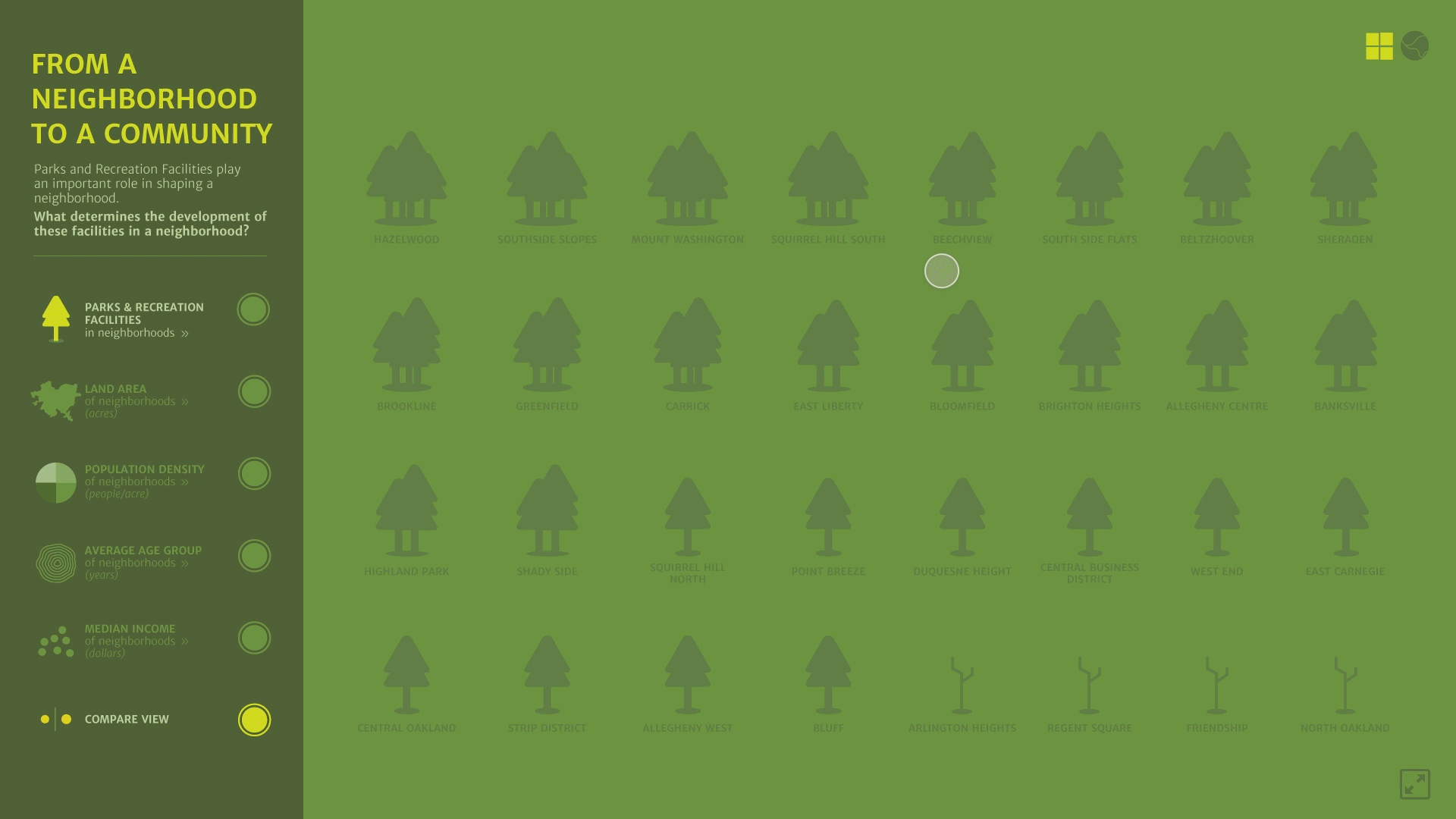
4. List View Compare: The list view allows to compare multiple neighborhoods at a given time. It would be useful if one wanted to compare a certain type of neighborhoods together.
How can I take this further?
Features I should include: • Sort and Filter • How to use section • More details for Onboarding • Compare feature in Map view (Information on adjacent neighborhoods can be important in understanding the overall planning of these facilities).
Find better data: The number of parks and facilities in a neighborhood is not representative of the size/capacity of the facility. A neighborhood may have 5 facilities but they could be really small and insufficient to meet the needs of the community
Further usability testing with stakeholders and refinement of the UI elements.
Make the user interactions accessible: I took in consideration visual compatibility for color blindness while developing the visual design system. One of the intent of the platform is to get people more involved in the civic infrastructures around them, and to achieve this it would be vital to make this experience accessible to differently-abled people.
05 TAKEAWAY
Value in visualizing
Data Visualization can do more than just provide answers based on patterns and relationships. When things don’t line up like the way we expect them to, one can use the data to surface problems, evaluate and find opportunities.
“Look for the question, not the solution.”
Intervention Opportunities: As I layered up the visuals, the data became more easy to process. With each steps, I could think of so many other ways this visualization could be used as a tool for information and analysis.
This visualization can help civic authorities to discover/map patterns and inform future planning.
It can also serve as a resource for local citizens to advocate for the development of parks and recreation facilities in their neighborhood.
The city can plan seasonal shelters in low-income neighborhoods
Recreation centers in populations with 60+ age groups
Planning health camps in the existing facilities in low-income neighborhoods

If interested, read my blog detailing the complete process of this project.
MORE PROJECTS