Carnegie Mellon Student Information Portal Redesign
This project focuses on rethinking the home page of the Carnegie Mellon Online Student Information Online (SIO) Portal to facilitate a better user experience and engagement. The Student Information Online website is an important medium of communication between the school and its students.
MY ROLE: Exploratory research (Card Sort, Tree test, Speed dating), Information architecture redesign, Dashboard wireframing
TOOLS: Illustrator, Optimal Workshop, Sketch
Defining Project Scope
This project had started off as a in-class web design project, and in the process, I observed the need to understand the site navigation and rethink the user experience to make it more efficient and usable. The goal is to create a positive and thoughtful Home page experience for students who interact with the SIO.
At the start of this project I set up a brief of scope and goals to keep me in check of the process:
addressing the existing Information Architecture challenges with an improved design
involving end users in the exploratory and evaluative stages
Stakeholders
I identified students as the main stakeholder as they are the ones at the user end of the portal. I also worked with the portal administrators to learn about their expectations and to get their feedback and perspective on my ideas for improvement.

Exploratory Research

Understanding existing experiences
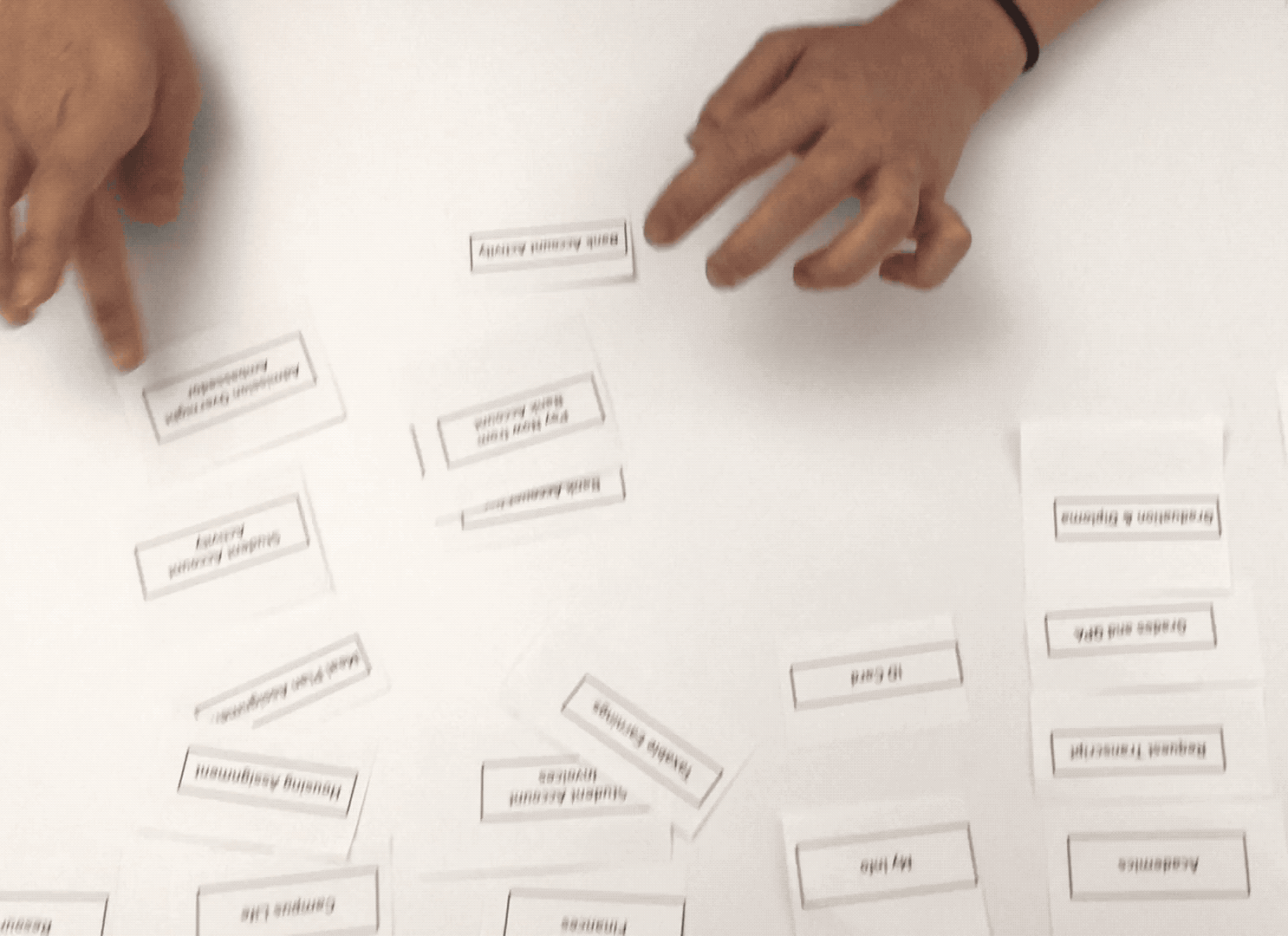
I observed 9 users do the card sort based on their current interaction and understanding of the SIO site while they verbally described their decisions.
They performed the following tasks:
Arrange the cards from memory to best replicate the existing navigation of the SIO.
Build their preferred Information structure of the portal
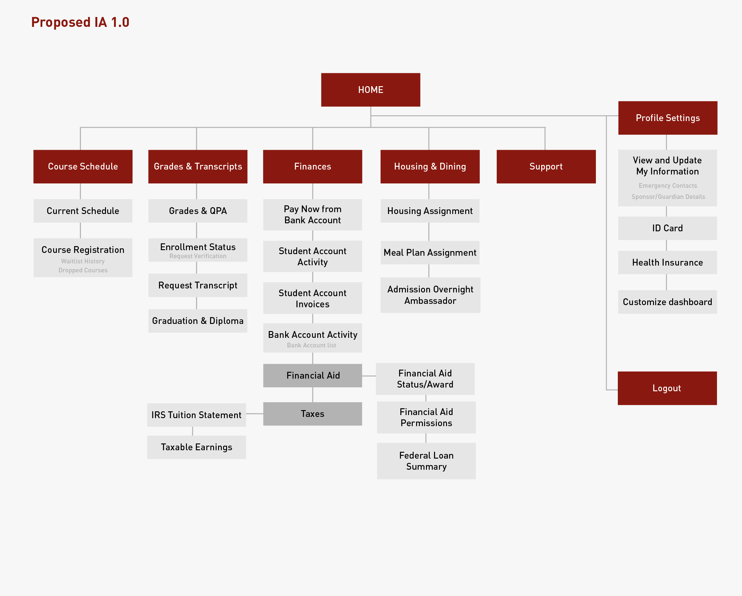
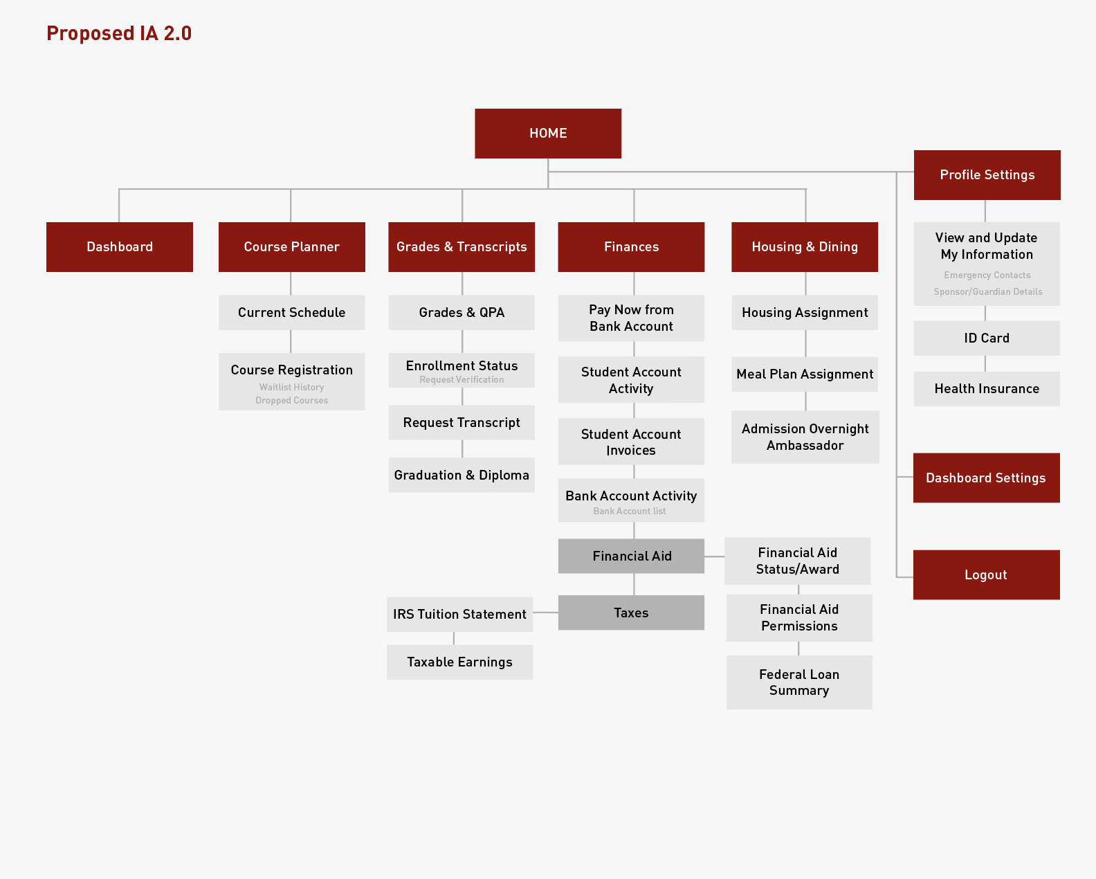
Information Architecture
Click on image to enlarge
These are the inferences I drew based on user comments and the observations I made.
Click on image to enlarge
Click on image to enlarge
Additional questions like –How frequently do you use SIO? What do you use SIO the most for? What types of academic and administrative information do you want/need to keep track of?–helped me collect more background information about user interaction with SIO.

Design Opportunity
I identified three main student categories based on their needs and expectations from the SIO portal. Although most users have maximum interaction with the portal while planning and registering for courses, students on federal loans expressed the need to stay on top of their finances. For students living on-campus, housing and meal plan assignments were equally important.

I also interviewed the portal administrator for the school and they shared their goals from this portal. Together, I built this goal diagram for the stakeholders that would also serve as my design principles.

Iterations & testing
Based on the findings from the initial Card sorting activity, I re-organized the existing system to increase intuitive use and reduce the time to learn and recall the system.
Tree Test
To test the usability of the proposed IA, I set up a tree test for the users. I used Optimal Workshop’s Treejack application. Tree testing helped to evaluate the clarity of the new labels for the categories without the visual cues and distraction and test the site structure before the interface design. I ran this test with 6 CMU students.
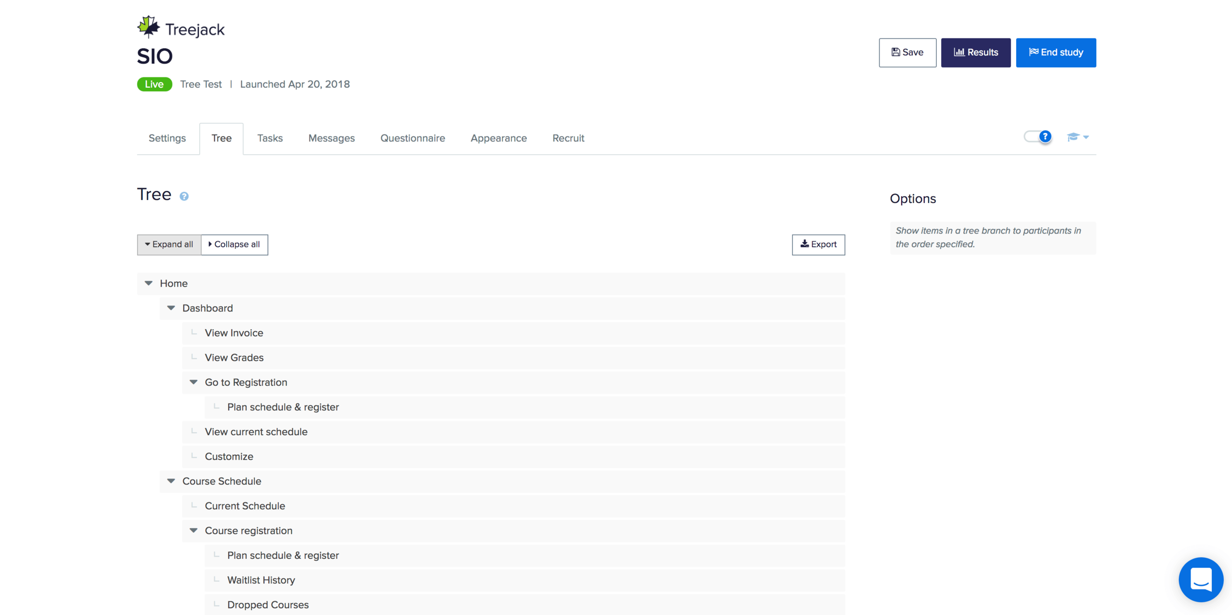
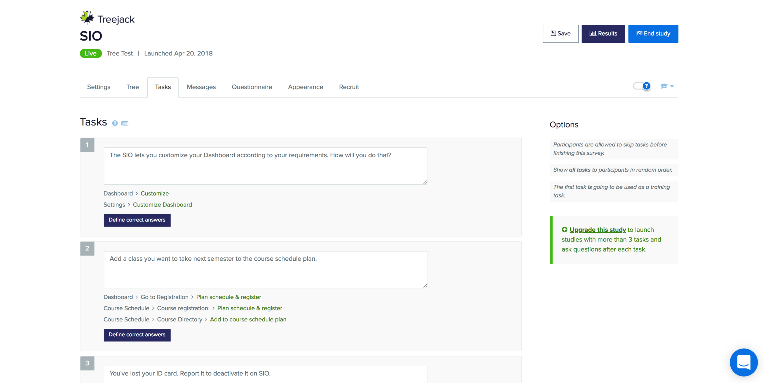
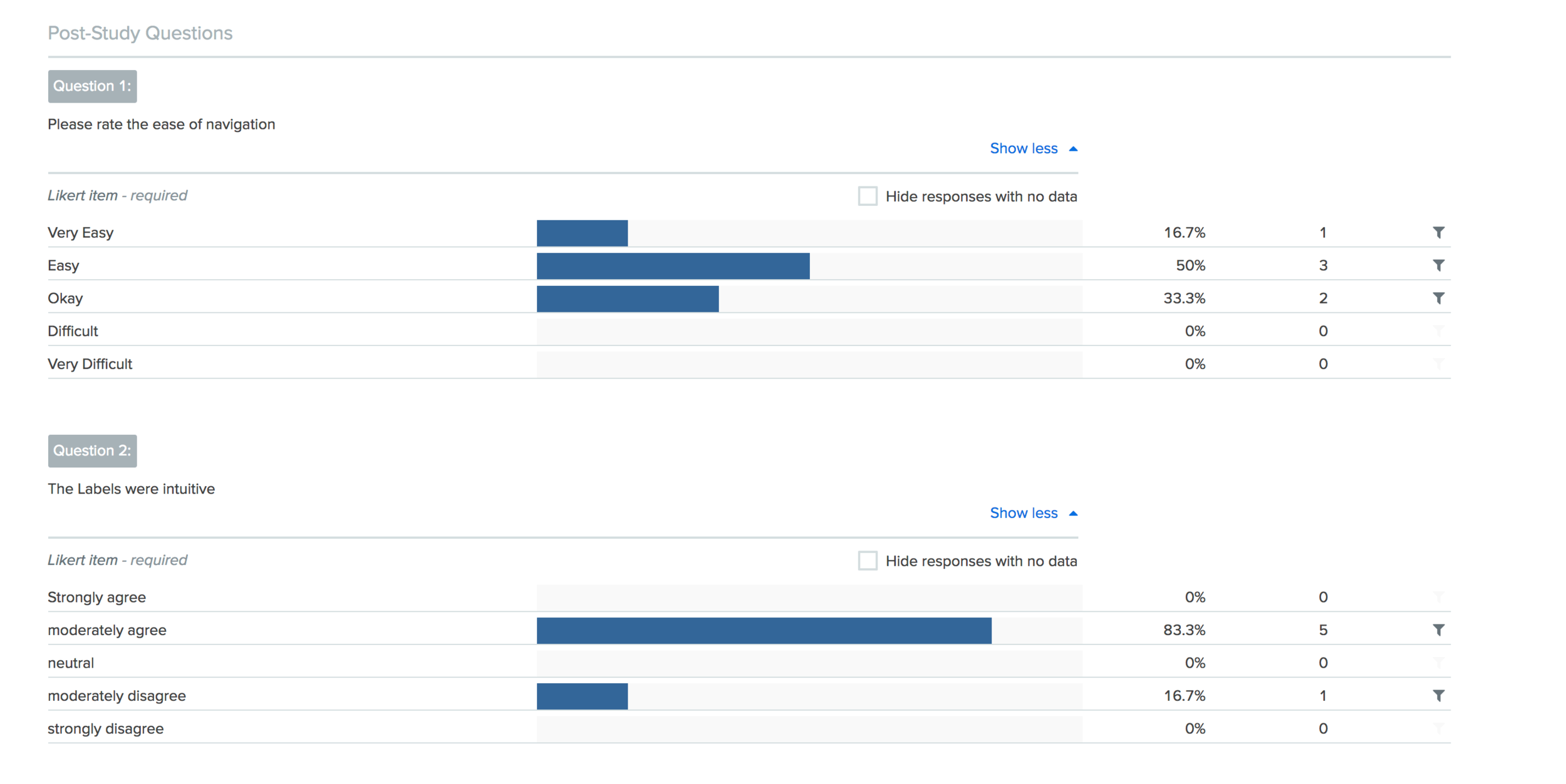
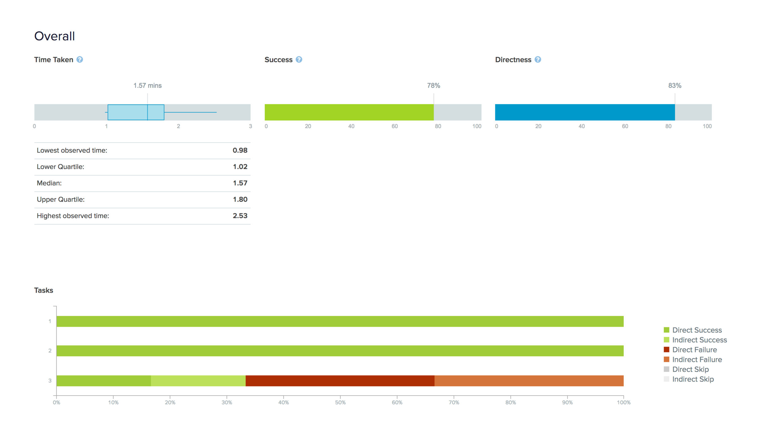
Here are my findings from the tree test:
Most users thought that the labels were intuitive.
The result for ease of navigation varied from okay to very easy.
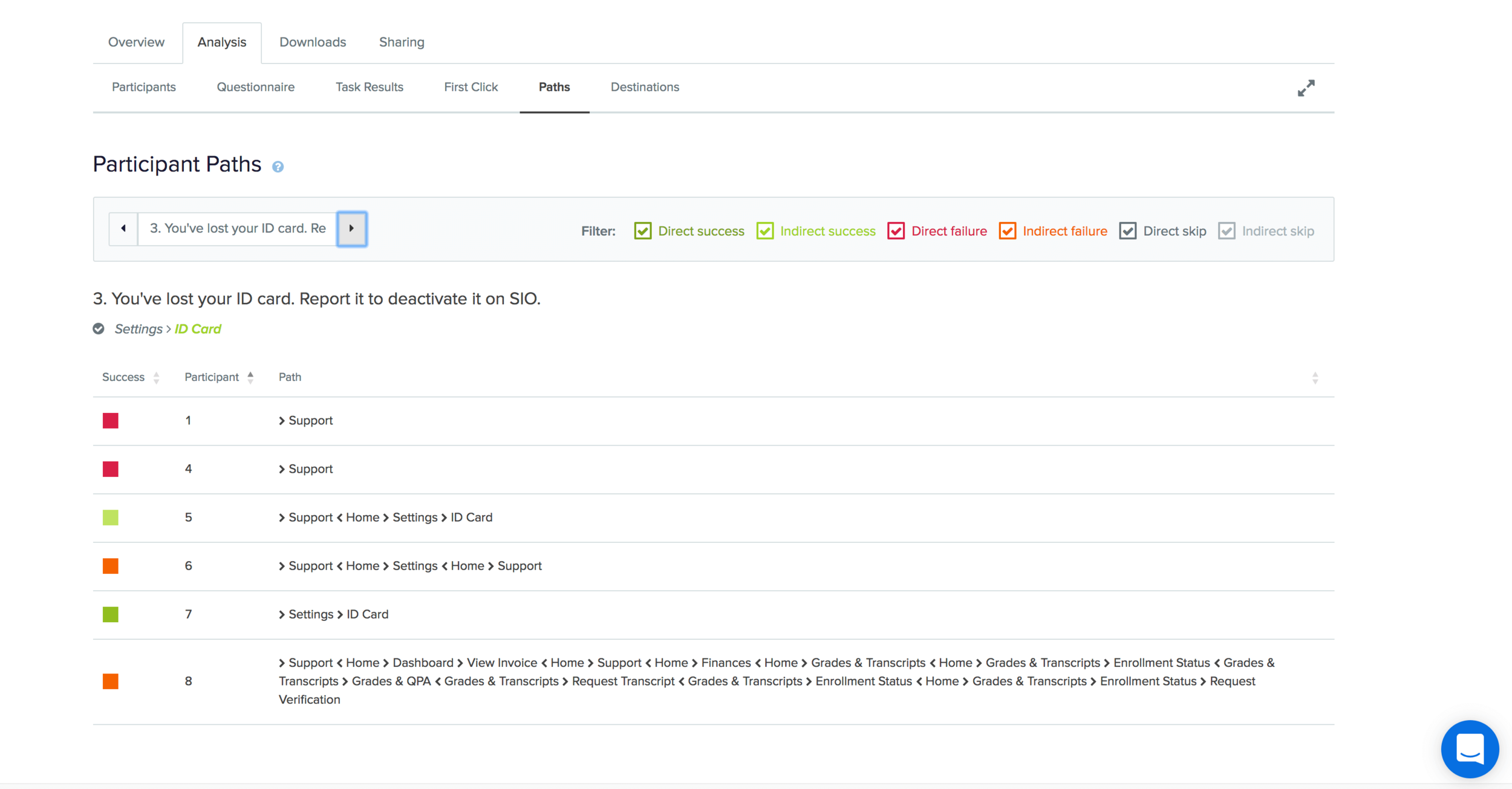
Participants performed most tasks in the first attempt except one where they felt that the label was misleading.
The mislabeled category led to the idea of introducing another category called, ‘Administrative support’. This could address the user need of having a central hub/point for administrative tasks like campus parking permits, accessibility requests, key request etc. I still needed to test the feasibility of adding this category to the existing information structure.
Click on image to enlarge
Dashboard development
Along with the tree test, I simultaneously tested a low-fidelity mock up of the homepage to understand the effect of visual cues/design on the ease of navigation. I redesigned the dashboard to give users increased control on the information available to them and simplify their task by grouping all important elements at a single place.
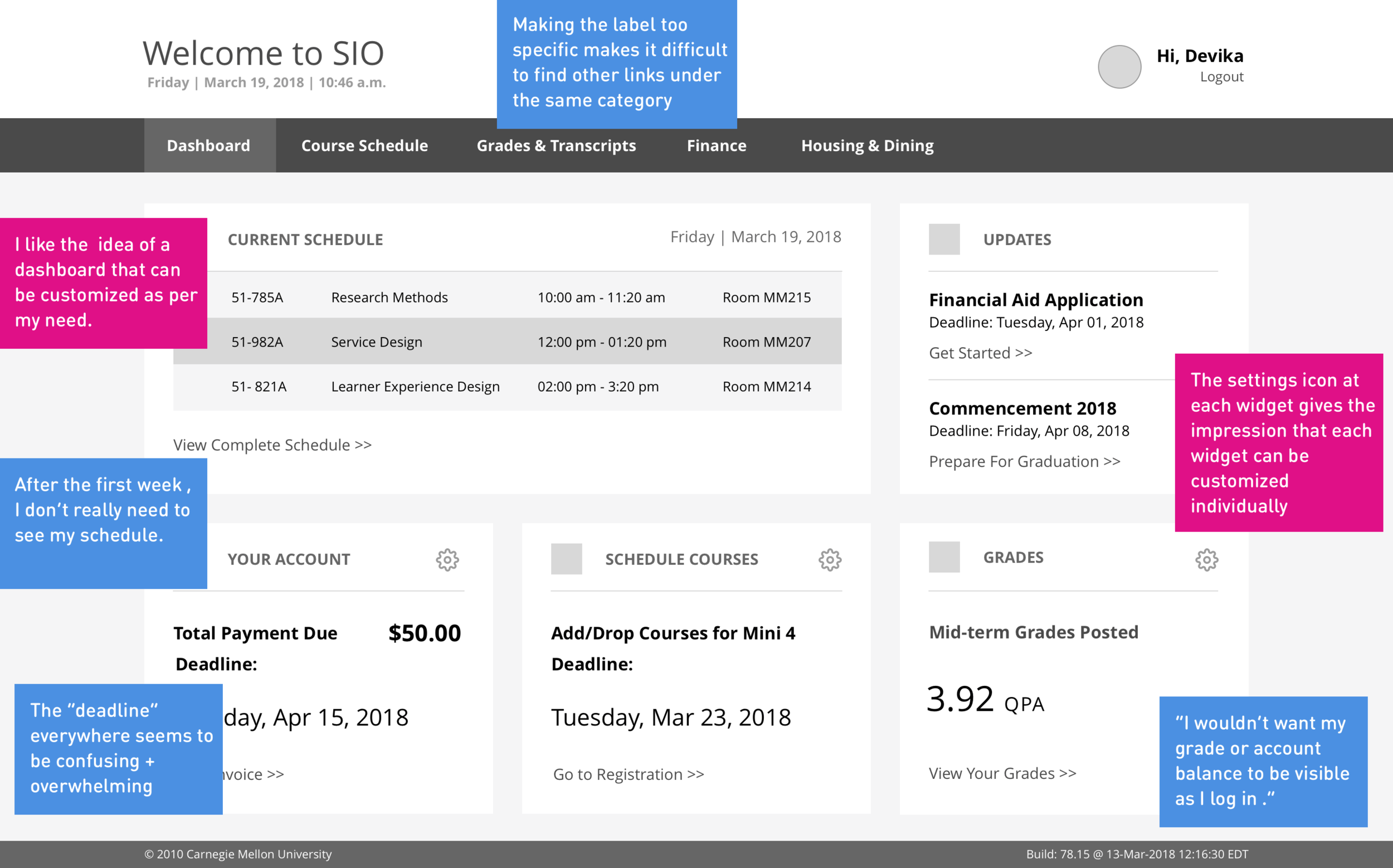
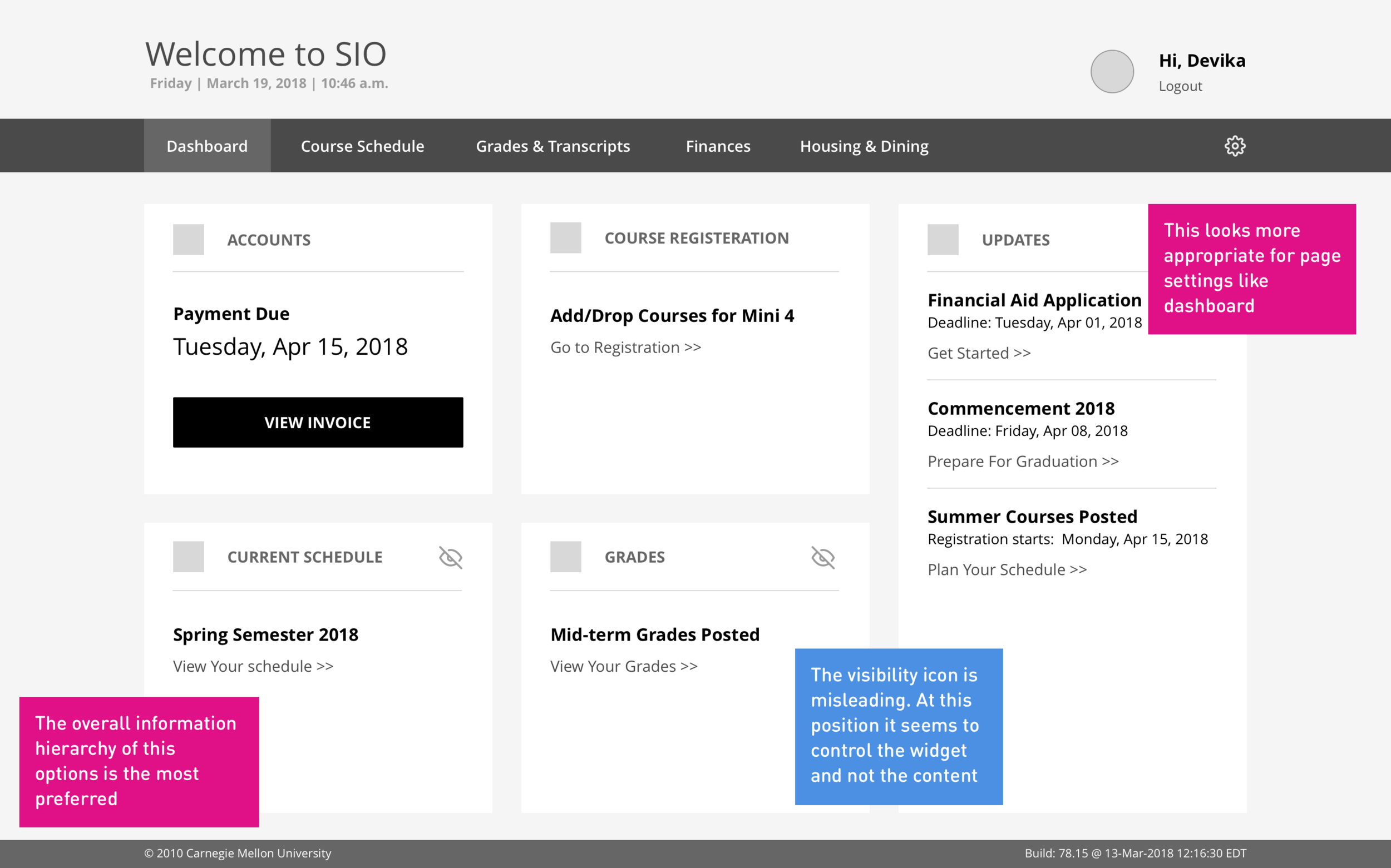
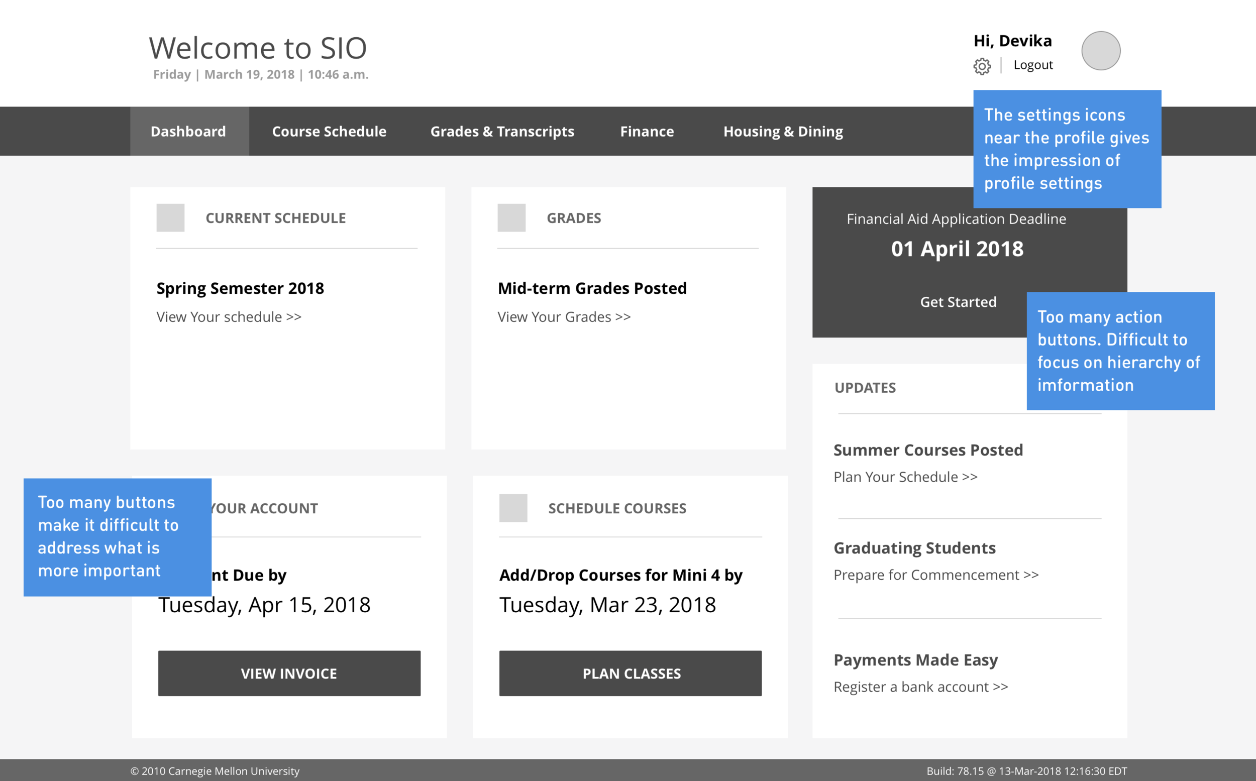
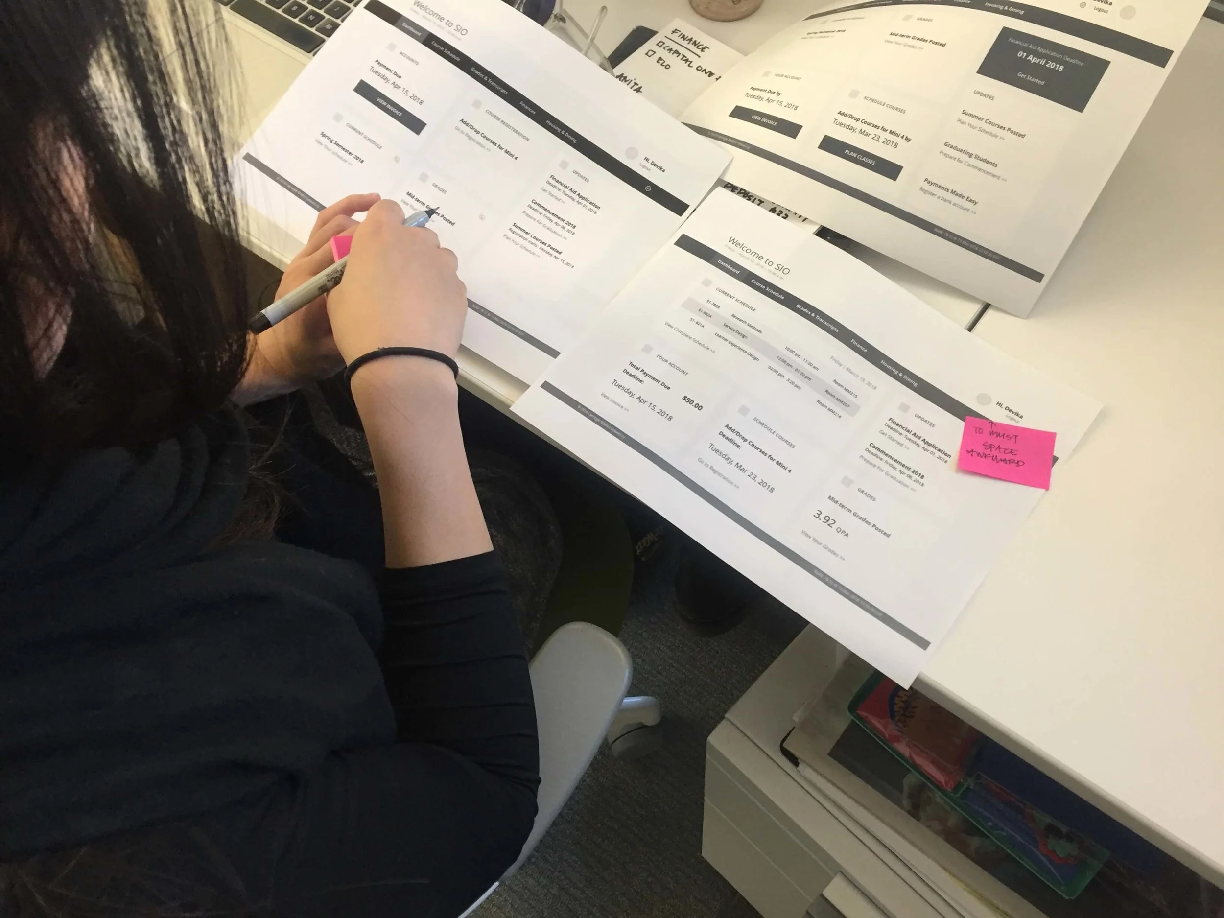
I presented three dashboard options in the form of prints and asked users to add their feedback and understanding of the Interface. I tested this with 5 users.
Here are the main findings:


Having more than one action button is overwhelming for users
Users like the idea of having a dashboard but at the same time don’t want personal information visible on log in, information like their grades or finances.
Users are aware that profile settings can be accessed by clicking on the username.
The idea of being able to customize the dashboard was appreciated.
Option 2 which was the simplest of the three was preferred by most.
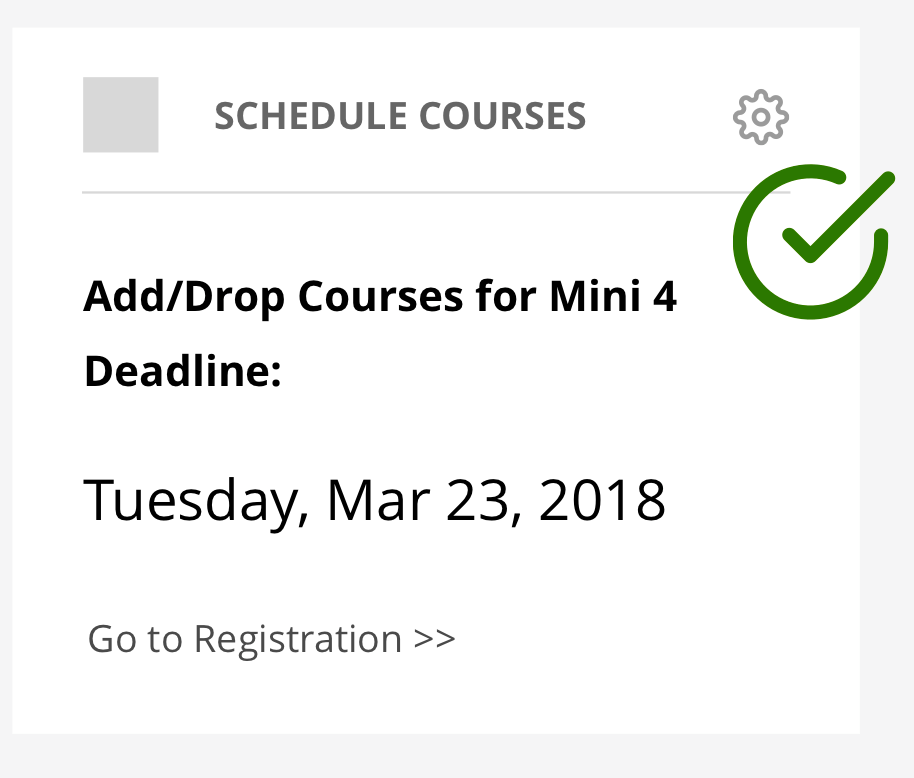
Hi-fidelity wireframes
Based on the feedback received, I designed some high-fidelity screens to test the interface further.
Proposed Dashboard
Click on Image to enlarge
Click on Image to enlarge
Profile Settings Page
The profile setting were initially nested under a category called My Info. This category maintains a student’s personal setting and basic information like address etc.
The label seems misleading as most of the information on a student’s portal is information relevant to them. During the initial sort test, students would move all the features relevant to them under this category.
I moved the category from the navigation bar and made the personal settings accessible by clicking on the user name. Further testing supported the decision as users are intuitive enough to click on username to access personal settings.
Existing My info page
Click on Image to enlarge
Proposed Profile Settings Page
Click on Image to enlarge
Click on Image to enlarge
Next Steps
Develop a few pages to test the user flow from the dashboard.
Conduct usability testing for the new user interface and test the new features proposed.
Explore and design the Support page further
Develop the mobile experience.
While this project focused mainly on the information architecture and redesigning the dashboard experience, the insights from this activity can be useful to relook at the course registration process and interaction of the other features I didn’t get into the detail of.